SARA FERNANDEZ SALVADOR
Nutriskin Rebranding
About
This project involved the complete rebranding of Nutriskin, a 50-year-old skincare brand. The logo, packaging, and label design were redesigned to create a cohesive, modern visual identity. The rebrand aimed to unify the brand’s image and attract a new generation while honoring its long-standing heritage.

Role: Project Leader
As the project leader, I oversaw both the Research & Development and Marketing teams, guiding the project from initial consumer research through to launch. I coordinated cross-functional efforts, ensured alignment on objectives, and managed timelines for the rebranding of Nutriskin’s extensive product line.
Background
Initial Brand Positioning & Challenges
Nutriskin is a brand that has been in the Panamenian market for over 50 years. At first, it began as a direct competitor with Ponds, offering a similar product to the Cold Creams for a more lower price. The brand has developed throughout the years, offering a wide variety of product lines such as hand & body creams, facial cleansers, hand soaps and more.
Although Nutriskin’s product portfolio has expanded, their has not been a consistent brand image that follows all the product lines. Their seems to be no consistency and unity with each product line. Furthermore, the consumer perception of the brand has shifted from a reliable and trendy skincare brand to outdated. This is due to the lack of variety and innovation with the packaging and label design.

Magazine Ad 2015
Relaunch Strategy
New Positioning
This product relaunch will aim to shift the brand’s perception of an outdated and messy brand to a more modern, simple and functional skincare brand that offers a wide variety of products for every need without over complicating the process.
Target Audience
Nutriskin has loyal consumers that have used the brand more many years. However, without a solid brand image, it has been overlooked by the new generations. With this brand relaunch, Nutriskin will not only be for the older generation but rather for everyone that is looking for a simple and accessible solution to their skincare problems with products that focus on natural ingredients.
Vision and Mission
The brand aims to position itself as a trusted ally in personal care, offering solutions that simplify everyday life. The goal is to eliminate any source of stress or worry by providing simple and accessible alternatives. We focus on creating an easy, hassle-free care experience, with an emphasis on empathy and well-being, being a brand that listens, understands, and supports.
Strategy
The brand relaunch will imply not only updating the logo that has been part of the brand for over 50 years but also unifying the label designs, updated the product packaging and replacing undeperforming products with new innovative, trendy and scietificaly proven products.
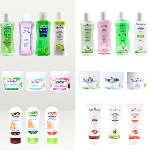
Old Image
New Image
Process and Actions Taken
Consumer Research
The project began with extensive research, including focus groups, interviews, and surveys to understand consumer perceptions, needs, motives, and values. Insights revealed that Nucriskin was seen as old-fashioned and not relevant for younger audiences, which guided the strategy for the rebrand.
The logo was updated to a serif style with the italies removed, creating a more elegant look while retaining the leaf motif toconvey a balance of playfulness, elegance, and natural appeal. Label designs were standardized across the line to highlight both the ingredients and product benefits, with English translations added. Body lotion packaging was redesigned to modernize its appearance, allow for more creative design, and streamline production by eliminating two labeling steps.
Implementation & Market Transition
A comprehensive transition plan was developed to manage the switch from old to new packaging across 30 products, including health department registrations and forecasting market impact in retail stores.
Launch & Marketing Strategy
The brand relaunch employed a 360° marketing approach, including a commercial, influencer partnerships, in-store experiences with free facials, out-of-home advertising, and promotional discounts to rotate existing stock.
.jpg)
New Micellar Water
Television Ad
The ad portrays Nutriskin as a constant companion throughout life, following three women at different stages and lifestyles. Each moment reflects how skincare needs change over time, while the brand remains a familiar, trusted presence.
Social Media Campaign
Photoshoot
The photoshoot was designed to reflect Nutriskin’s new visual identity, embracing a minimal, natural, and clean aesthetic. Bright color accents and subtle contrasts were introduced while maintaining a predominantly white palette, reinforcing a fresh, modern look that signals clarity, simplicity, and trust.


